
Baron Fig
Branding / Visual Design
Baron Fig
Revamping the Digital Style Guide for a Startup Stationery Brand
Branding / Visual Design
Brand Principles
The first step was to define the brand’s voice and mission and capsule them into three Brand Principles.

Accessibility Guidelines
Accessibility guidelines were created to improve the user experience of the brand’s online presence, also to give the brand a consistent look and feel.

Typography
The original Baron Fig site used Brandon Grotesque and Proxima Nova, two very similar looking typefaces, for headlines and bodies respectively. For the new design, I used the sans serif typeface Raleway(black) for headlines to give the brand a modern and utility feel. For bodies, I used Alegreya(regular), an elegant serif typeface, to create an appropriate contrast against headlines and a clear sense of information hierarchy.

Color Palette
The new color palette is a tonal variation of the original color palette. The saturation was also increased to give the brand a more modern and dynamic look.

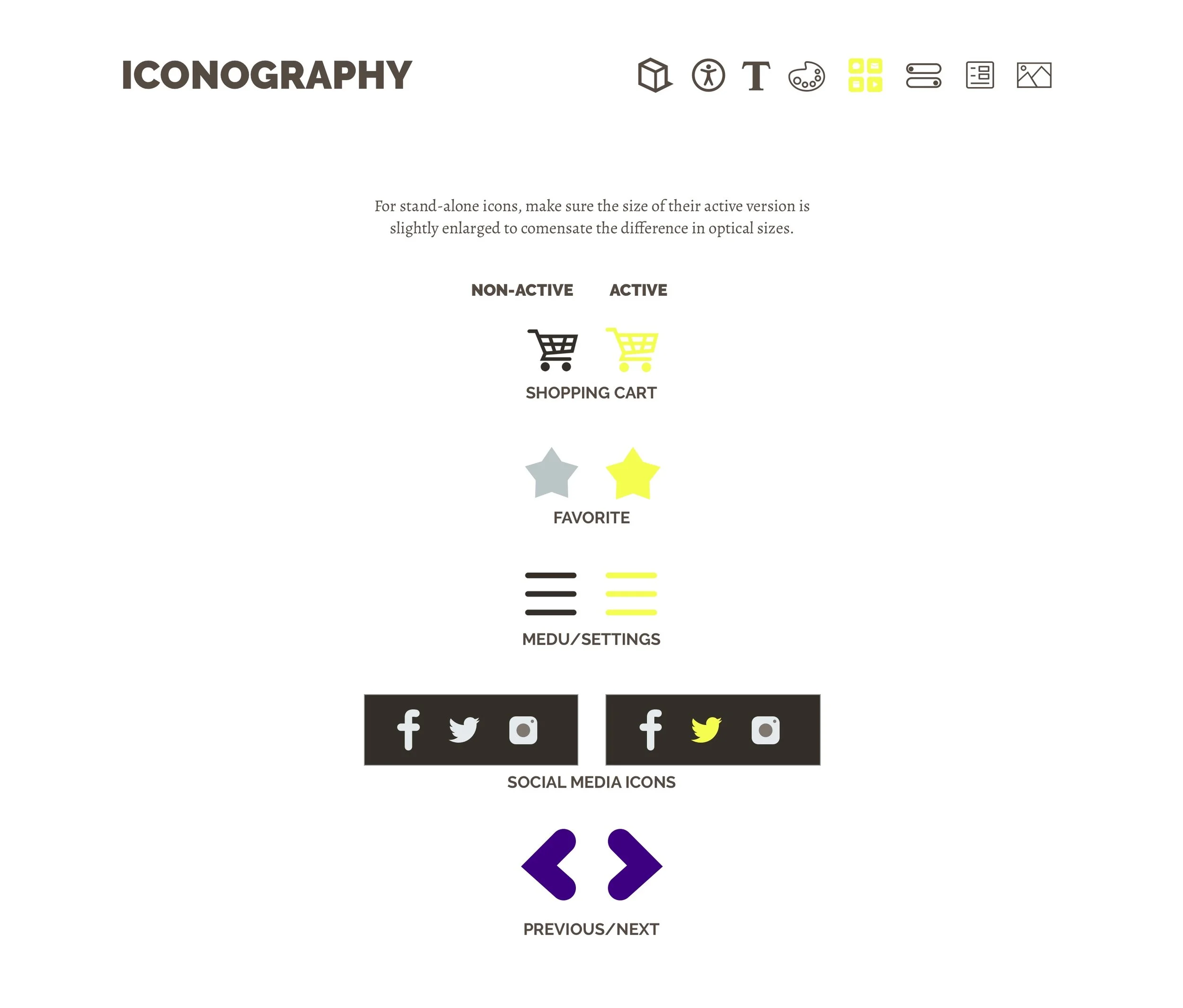
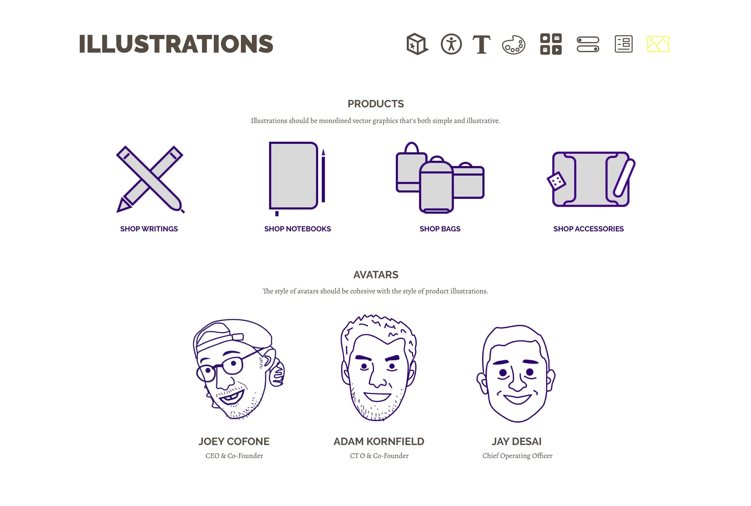
Buttons, Forms, Icons and Illustrations
The new icons and illustrations continue to follow a minimalistic style, with rounded corners and more details added to be more friendly and illustrative.